
The secret life of fonts
Published: April 26, 2022
Whether it is a traffic sign, clothing brand or TikTok, somebody somewhere has made a decision about which font to use to communicate a message. But who is making that decision and how? Dr Keith Murphy, based at the University of California, Irvine in the US, is finding out
GLOSSARY
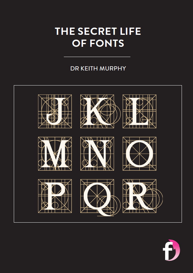
TYPE – originally, a small piece of metal containing a single raised letter or character that can be arranged to print words onto paper
TYPEFACE – a set of letters that share a common design, such as Times New Roman and Comic Sans
FONT – variations within a typeface. A font describes a set of letters that share a common design, including its size, weight, style and character set (Roman, Cyrillic or Greek). For example, Arial, Arial Black and Arial Narrow are all fonts of the Arial typeface. The term font also refers to the piece of software that allows text to appear and function properly on a computer or smartphone screen
Humans have been communicating with symbols and pictures for over 5,000 years. Printing, however, started to take shape during the Han Dynasty (206 BCE-220 CE). Described as one of China’s Four Great Inventions, the Chinese discovered how to print on paper using blocks of wood and other materials. By the 11th century, the Chinese and Koreans were using an early form of moveable type – single, raised characters on pieces of clay that could be rearranged and used to impress ink onto paper. But it was not until the 1440s, when Johannes Gutenberg invented the Gutenberg press, that moveable type and printing became a worldwide phenomenon.
“During the Renaissance and later, lots of type foundries – shops that design and manufacture metal type – sprung up across Europe and, later, the Americas, each of which created and sold its own sets of typefaces,” explains Dr Keith Murphy at the University of California, Irvine. “From early on, these foundries tried to set themselves apart from the competition by marketing their typefaces in different ways, which tended to involve a lot of over-hyped descriptions of what each typeface could communicate.”
Keith is a linguistic anthropologist. Linguistic anthropologists study the nature of language and how humans use it in their everyday lives, but Keith is taking his research in an unusual direction. He is exploring the role fonts play in society and how they are used to influence the way we communicate.
WHY DO FONTS MATTER?
“Fonts give us the opportunity to do more with language, beyond simply expressing ideas and feelings,” says Keith. We can play with fonts. For example, the Mocking SpongeBob meme UsEs LeTtErS LiKe ThIs tO rEpReSeNt sArCaSm. We can use fonts to deceive people. Think of websites that copy the fonts of legitimate news sites to spread disinformation. We can also use fonts to strengthen communities. Developing typefaces for Cherokee, for example, has helped preserve this endangered language in the US.
When desktop computers first entered mainstream use in the 90s, many people felt too intimidated to get onboard with the new technology. Therefore, Comic Sans was designed as a ‘friendly’ font with soft lines. It helped a generation of people to adapt to using text on screen. Since then, Comic Sans has arguably become the most contested font, with many accusing it of being overused and unprofessional.
In 2012, CERN used Comic Sans in a presentation announcing the discovery of the Higgs boson or ‘God particle’, one the most significant scientific breakthroughs in recent years. Seeing the font in this academic context caused an uproar online and, that week, ‘Comic Sans’ trended higher than ‘God particle’ on Twitter. Similarly, the clothing retailer Gap became acutely aware of the power of fonts when, in 2010, it was forced to reverse its decision to change its logo font after less than a week of intense backlash on social media.
“In the USA, presidential candidates pay a lot of money to license particular fonts to use in their campaigns, preferably ones that help communicate specific messaging,” says Keith. There are even examples of fonts becoming weaponised. In Nazi Germany, Adolf Hitler banned the use of almost all modern Latin fonts, insisting on old-fashioned blackletter fonts to connect his propaganda to historic German values (he later reversed the ban).
HOW IS KEITH STUDYING FONTS?
To understand fonts, we need to think about where they come from and how they get out into the world. If fonts have a social, cultural and political force, who is facilitating and managing that force, and how are they doing it? To answer these questions, Keith is using ethnography and discourse analysis.
“A significant part of my research involves talking to and hanging out with people who make fonts or work with letters and writing systems in some way in their everyday lives,” says Keith. Known as ethnography, the aim is to observe and work alongside graphic language experts to understand what they do, exactly, rather than relying on what they say they do or what other people say they do.
Discourse analysis looks at how humans use language, and the meaning of language in certain social contexts. “Some methods focus on printed text, some focus on spoken conversations, but they all require very close attention not only to what is said, but also how it is said, by whom, to whom or for whom, in what contexts, in what formats, and more,” explains Keith.
WHAT IS KEITH’S RESEARCH REVEALING?
The ways in which typefaces take on social, cultural and political meanings has already been mentioned, but Keith’s work also highlights the high level of knowledge, patience and skill needed to design typefaces. Designers have much more to consider than we realise: What do letters look like at different sizes?
How spaced apart do letters need to be? How do you create fonts for non-alphabetic languages such as Chinese or Japanese? How do you ensure that all the world’s languages have a digital font they can use? Some do not, which makes using computers and the internet difficult. “One way that people working in this area contribute to social justice is by contributing to ‘script justice’,” says Keith, “by making sure that users of even the least common writing systems have a way to type and communicate in their own language.”
Indeed, on the surface, working with letters might seem frivolous, but, as Keith says, it is important that there are people who think about and maintain the underlying code and systems that allow that graphic text to work. “Graphic language experts are doing a lot of hard work to make sure we don’t notice what’s going on just below the surface, because if we start to notice, then things start to slow down or even stop. If we want the systems that support modern society running smoothly, we have to consider the work that the fonts are doing in that support.”
Reference
https://doi.org/10.33424/FUTURUM254


TYPE – originally, a small piece of metal containing a single raised letter or character that can be arranged to print words onto paper
TYPEFACE – a set of letters that share a common design, such as Times New Roman and Comic Sans
FONT – variations within a typeface. A font describes a set of letters that share a common design, including its size, weight, style and character set (Roman, Cyrillic or Greek). For example, Arial, Arial Black and Arial Narrow are all fonts of the Arial typeface. The term font also refers to the piece of software that allows text to appear and function properly on a computer or smartphone screen
Humans have been communicating with symbols and pictures for over 5,000 years. Printing, however, started to take shape during the Han Dynasty (206 BCE-220 CE). Described as one of China’s Four Great Inventions, the Chinese discovered how to print on paper using blocks of wood and other materials. By the 11th century, the Chinese and Koreans were using an early form of moveable type – single, raised characters on pieces of clay that could be rearranged and used to impress ink onto paper. But it was not until the 1440s, when Johannes Gutenberg invented the Gutenberg press, that moveable type and printing became a worldwide phenomenon.
“During the Renaissance and later, lots of type foundries – shops that design and manufacture metal type – sprung up across Europe and, later, the Americas, each of which created and sold its own sets of typefaces,” explains Dr Keith Murphy at the University of California, Irvine. “From early on, these foundries tried to set themselves apart from the competition by marketing their typefaces in different ways, which tended to involve a lot of over-hyped descriptions of what each typeface could communicate.”
Keith is a linguistic anthropologist. Linguistic anthropologists study the nature of language and how humans use it in their everyday lives, but Keith is taking his research in an unusual direction. He is exploring the role fonts play in society and how they are used to influence the way we communicate.
WHY DO FONTS MATTER?
“Fonts give us the opportunity to do more with language, beyond simply expressing ideas and feelings,” says Keith. We can play with fonts. For example, the Mocking SpongeBob meme UsEs LeTtErS LiKe ThIs tO rEpReSeNt sArCaSm. We can use fonts to deceive people. Think of websites that copy the fonts of legitimate news sites to spread disinformation. We can also use fonts to strengthen communities. Developing typefaces for Cherokee, for example, has helped preserve this endangered language in the US.
When desktop computers first entered mainstream use in the 90s, many people felt too intimidated to get onboard with the new technology. Therefore, Comic Sans was designed as a ‘friendly’ font with soft lines. It helped a generation of people to adapt to using text on screen. Since then, Comic Sans has arguably become the most contested font, with many accusing it of being overused and unprofessional.
In 2012, CERN used Comic Sans in a presentation announcing the discovery of the Higgs boson or ‘God particle’, one the most significant scientific breakthroughs in recent years. Seeing the font in this academic context caused an uproar online and, that week, ‘Comic Sans’ trended higher than ‘God particle’ on Twitter. Similarly, the clothing retailer Gap became acutely aware of the power of fonts when, in 2010, it was forced to reverse its decision to change its logo font after less than a week of intense backlash on social media.
“In the USA, presidential candidates pay a lot of money to license particular fonts to use in their campaigns, preferably ones that help communicate specific messaging,” says Keith. There are even examples of fonts becoming weaponised. In Nazi Germany, Adolf Hitler banned the use of almost all modern Latin fonts, insisting on old-fashioned blackletter fonts to connect his propaganda to historic German values (he later reversed the ban).
HOW IS KEITH STUDYING FONTS?
To understand fonts, we need to think about where they come from and how they get out into the world. If fonts have a social, cultural and political force, who is facilitating and managing that force, and how are they doing it? To answer these questions, Keith is using ethnography and discourse analysis.
“A significant part of my research involves talking to and hanging out with people who make fonts or work with letters and writing systems in some way in their everyday lives,” says Keith. Known as ethnography, the aim is to observe and work alongside graphic language experts to understand what they do, exactly, rather than relying on what they say they do or what other people say they do.
Discourse analysis looks at how humans use language, and the meaning of language in certain social contexts. “Some methods focus on printed text, some focus on spoken conversations, but they all require very close attention not only to what is said, but also how it is said, by whom, to whom or for whom, in what contexts, in what formats, and more,” explains Keith.
WHAT IS KEITH’S RESEARCH REVEALING?
The ways in which typefaces take on social, cultural and political meanings has already been mentioned, but Keith’s work also highlights the high level of knowledge, patience and skill needed to design typefaces. Designers have much more to consider than we realise: What do letters look like at different sizes?
How spaced apart do letters need to be? How do you create fonts for non-alphabetic languages such as Chinese or Japanese? How do you ensure that all the world’s languages have a digital font they can use? Some do not, which makes using computers and the internet difficult. “One way that people working in this area contribute to social justice is by contributing to ‘script justice’,” says Keith, “by making sure that users of even the least common writing systems have a way to type and communicate in their own language.”
Indeed, on the surface, working with letters might seem frivolous, but, as Keith says, it is important that there are people who think about and maintain the underlying code and systems that allow that graphic text to work. “Graphic language experts are doing a lot of hard work to make sure we don’t notice what’s going on just below the surface, because if we start to notice, then things start to slow down or even stop. If we want the systems that support modern society running smoothly, we have to consider the work that the fonts are doing in that support.”
 DR KEITH MURPHY
Associate Professor of Anthropology
University of California, Irvine, USA
FIELD OF RESEARCH: Linguistic Anthropology
RESEARCH PROJECT: Researching how fonts operate as a social and cultural technology
FUNDERS: US National Science Foundation (NSF) under grant number 1851282, Wenner-Gren Foundation
DR KEITH MURPHY
Associate Professor of Anthropology
University of California, Irvine, USA
FIELD OF RESEARCH: Linguistic Anthropology
RESEARCH PROJECT: Researching how fonts operate as a social and cultural technology
FUNDERS: US National Science Foundation (NSF) under grant number 1851282, Wenner-Gren Foundation
ABOUT LINGUISTIC ANTHROPOLOGY
Everything you read, hear, say, or write has an impact on who you are and the way you interact with the world around you. Language is so important to our lives that it is easy to take it for granted. But when we take a moment to stop and think about language, we make way for an endless list of fascinating questions. How do children learn languages? How do adults learn languages? How do bilingual people’s brains work? How do we change the way we speak to suit the social situation? How are languages lost and created around the world and across time?
BRINGING PEOPLE INTO THE PICTURE
Linguistic anthropology concerns itself with these same sorts of questions, examining how language, humans, culture and society all relate to one another. “Users of language are always the primary focus – including speakers of spoken languages, signers of sign languages, and readers of texts – and any analysis of language will always somehow bring people into the picture,” Keith explains.
Linguistic anthropology originated as a branch of anthropology that sought to document endangered indigenous languages. Since then, the field has grown to encompass analysis of all the ways languages influence the social life of humans. In this way, linguistic anthropology is closely related to sociolinguistics, a subfield of linguistics which studies languages in relation to social factors. The distinguishing feature of linguistic anthropology, however, is an emphasis on using ethnography in the research process.
WHERE COULD LINGUISTIC ANTHROPOLOGY TAKE YOU?
Many linguistic anthropologists work in academia, which involves teaching and publishing research at a university. However, their knowledge and research skills are valuable in other areas, too, such as consultancy, working on historic sites, translation and diplomacy. “Linguistic anthropologists work in lots of industries,” says Keith. “Including social media, industrial design, user experience, lexicography, journalism, advertising, market research and many others.”
EXPLORE A CAREER IN LINGUISTIC ANTHROPOLOGY
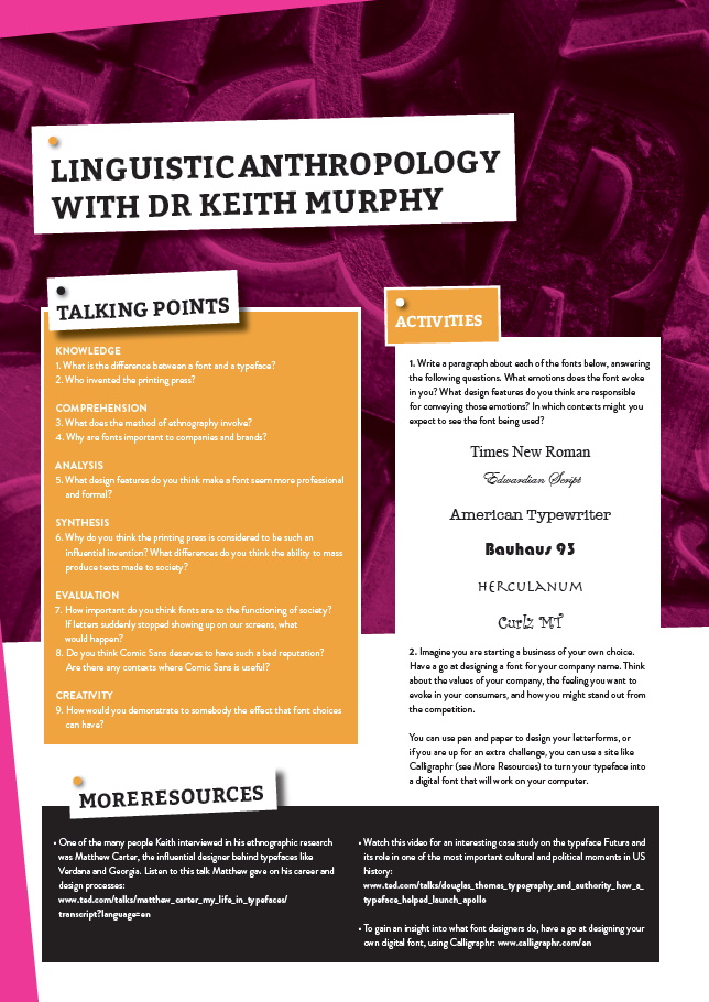
• Keep up to date with developments in the field by reading publications and attending events. The Society for Linguistic Anthropology (linguisticanthropology.org) has its own publication, the Journal of Linguistic Anthropology, and all issues are available through AnthroSource: anthrosource.onlinelibrary.wiley.com/journal/15481395
• AnthoGuide (guide.americananthro.org) is a great online tool, which is produced by the American Anthropological Association (www.americananthro.org) and lists available degrees, programmes and field schools offering training for anthropology students
• Learn.org has a webpage dedicated to linguistic anthropology, which says the average salary for all anthropologists, including linguistic anthropologists, is $50,000: learn.org/articles/Linguistic_Anthropologist_Career_and_Salary_FAQs.html
Anthropology is not usually taught at school or college but taking language subjects (Latin as well as modern languages) and social science subjects (for example, psychology, sociology and geography) is a useful starting point. Some universities offer undergraduate courses in linguistic anthropology. Alternatively, you may choose to study anthropology, narrowing down to linguistic anthropology at the master’s level. If you are looking for a career in research, completing a PhD is recommended.
HOW DID KEITH BECOME A LINGUISTIC ANTHROPOLOGIST?
I watched a lot of ancient history programmes on TV when I was a kid, and at some point, I decided I wanted to be an archaeologist. As a teenager, I worked on an archaeological excavation near where I grew up and decided to pursue it in college. In the US, most bachelor’s degrees in archaeology require you to take courses in anthropology, and I discovered that the linguistic anthropology courses were more interesting to me than the archaeology ones, so I began drifting in that direction.
I had a lot of mentors over the years who indirectly or directly nudged me into anthropology. One of my high school teachers really encouraged me to learn languages, even gifting me a set of “Teach Yourself Irish” cassette tapes (I never taught myself Irish). My first linguistic anthropology professor in college, Michael Silverstein, dazzled me with his brilliance and humour, and eventually became my undergraduate thesis advisor. And I applied to get a PhD at UCLA to work with Alessandro Duranti, Marjorie Goodwin, Chuck Goodwin and Elinor Ochs, all people whose work I’d read as an undergraduate and really enjoyed.
When I was accepted to the PhD programme at UCLA, I was overjoyed! I grew up in a working-class family, raised by a single mother, so there wasn’t really a model for me early on for what getting a PhD was all about. But with encouragement from my family and guidance from mentors at every stage of my education, I was able to make it through and start building a career.
I very much love teaching, which is part of what comes with being a professor. But when it comes to the research side of things, I really like talking to people about what they are experts in – the stuff of their own lives – that I can learn about and learn from. I like finding connections between things in the past and things in the present, and I like writing (sort of), or at least finding ways to express complicated ideas in ways that make people think.
I also really like taking things that seem not so complicated – like fonts – and doing a lot of research that shows how incredibly complex they are! And important! There’s so much about life that as ordinary people we take for granted. Part of what I like about my job is trying to dig deeper, to uncover why the stuff we take for granted is actually super special. My first book was about furniture designers in Sweden, so I have this interest in studying design and creativity in the context of language.
‘What is your favourite font?’ is the kind of question that type people bristle at, and I’ve come to see why. It’s hard to choose, but also, it changes depending on context. I’ll say that one that I’ve been using a lot lately is called Freight, designed by one of the first African American type designers, Joshua Darden. I also love the typeface Mrs Eaves, designed by Zuzana Licko for Emigre Fonts. But really, there are tons of others I love.
KEITH’S TOP TIPS
01 Identify what you’re truly curious about and follow that as much as you can.
02 Be open-minded about discovering new interests. You may even find ways to combine your interests in creative ways.
Do you have a question for Keith?
Write it in the comments box below and Keith will get back to you. (Remember, researchers are very busy people, so you may have to wait a few days.)